Netflix finally reinvents its TV interface with AI-driven search and vertical discovery
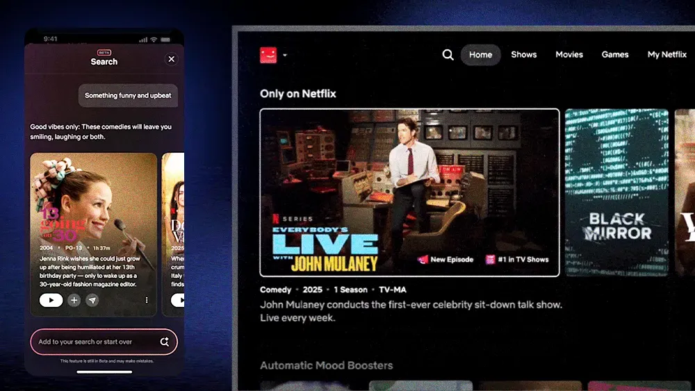
Netflix is rolling out its most significant TV interface revamp in over a decade, featuring a top-screen navigation bar and new mobile tools like an AI-powered search and a vertical discovery feed, all designed to make finding content quicker.Top-shelf navigation: The updated TV experience, which some users started seeing around May 19th, ditches the old left-side menu for a horizontal bar at the top, housing Search, Home, Shows, Movies, Games, and a new “My Netflix” section that bundles watch history and saved titles.Canvas for content: Netflix CPO Eunice Kim explained the prior interface was “built for streaming shows and movies,” but the new design offers a “more flexible canvas” to better showcase the platform’s expanding offerings, including live NFL games and a growing games library. The aim is to “pull you into the thrill of watching or playing at exactly the right time.”Smarter searching: On mobile, an OpenAI-powered conversational search is in beta. For instance, Netflix CTO Elizabeth Stone highlighted that users could ask for something “scary, but not too scary, and also maybe a little bit funny,” and confirmed such queries “will actually yield results in the new experience.” Netflix is also testing a vertical clip feed for mobile discovery.The bottom line: Netflix is betting a more intuitive design and AI-driven discovery will keep users engaged by reducing choice paralysis and surfacing relevant content faster across all its entertainment pillars.Streaming reactions: While Netflix revamps its main TV app, user reactions to the changes have been mixed on social media, with some critiquing the gaming focus.
Get the SOS. Brief
The sharpest streaming intelligence, delivered to your inbox.